/** Font types */

Posts Tagged ‘scrapbook layout’

Remember When (Plus A Free Photoshop Template)

Thursday, September 9th, 2010

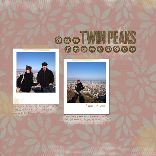
San Francisco with Dad

[Font: KD Everyday; Digital Kits:KD Rousti, KD Digi Essentials #2, KD Digi Essentials #5, KD Crush, KD Fly Girl – all font and kits by Karla Dudley. I made the polaroid frames myself.]

Free Download

You can get the polaroid template here. Either click on the link and unzip the file or right-click on it and opt for the “save file as” option.

(The template is for personal use only.)

The Story

These photos were taken with my husband’s Nexus 1 phone a couple weeks ago.

It was the last day trip we took with my parents before they came back home. We went to San Francisco and enjoyed the beautiful urban landscape and great cuisine.

At the end of the day, as the last rays of sun shone above us we went to Twin Peaks for a marvelous bird eye view. As we climbed higher and higher the wind became almost violent and blew in gusts tight through us but the view became even more amazing.

I am so glad my father had the opportunity to join us for the short climb and enjoyed the extraordinary view of the city. The look on his face was so precious that I still remember and cherish it.

Share

What is your last cherished memory? Please share it with me by leaving a comment on this post.

Welcome Little One Workshop
Check out Creativity Prompt’s new and unique self paced workshop: “Welcome Little One”. This workshop will provide you with everything you need, and then some, to make a fabulous handmade mini album to record the first moments of a new born baby.


Make Your Own Planner Workshop
Check out Creativity Prompt’s self paced workshop: “Capture Your Dream”. In this workshop you will capture, follow and make your dream come true as well as document your journey in a fabulous mixed media mini album.
Finally, A Breath Of Fresh Air And A New Layout

Saturday, July 31st, 2010

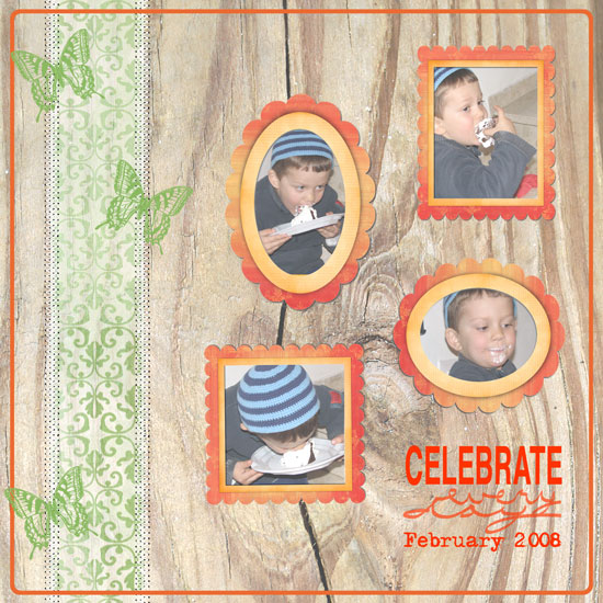
Celebrate Every Day

[Fonts: Helvetica, Adler; Digital Kits: Bazinga by Shimelle Laine and Digi Essentials by Karla Dudley.]

I took a personal challenge which took me away from my blog for a while. I had no time. No weekends. Almost no summer – but worse than all of that – absolutely no time, not even a few stolen minutes, to create.

Now I finally got my “freedom” and with it more time and a layout…

After a long pause in creating anything I feel rusty. I am not pleased with my layout but I am always giving myself permission to let go. Creating should be fun and not frustrating, so all the pressure gets tossed out and only the beautiful stories and enjoyment of the hobby get to stay in.

The important thing, in my opinion, is showcasing my nephew’s series of pictures that tells a story I remember fondly. The pictures remind me of that evening, celebrating his birthday on our first visit home after we have moved far away. I remember how he ravished the cake and enjoyed every little piece of it. A joy so pure, only a child knows how to experience it.

I don’t mind if the layout isn’t the prettiest of them all (what an understatement…) – at least I had a chance of playing with Shimelle’s fresh and summary kit, Bazinga.

Having said that, in a week and a half, my parents will cross the ocean and two continents to visit us here for the first time. They will stay with us for three weeks of much anticipated together time. Therefore I am not sure how steady will my posting schedule be, but I have so much planned. So many new tutorials, giveaways and a couple new workshops – so please be patient with me – I am sure you will be rewarded for that.

See you all real soon 🙂

Employ Your Sense of Humor – Journaling Prompt

Monday, June 14th, 2010

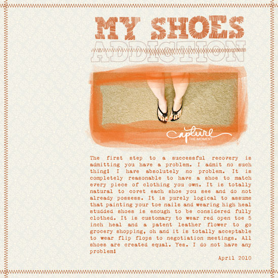
My Shoes Addiction

[Font: VT Portable Remington; Digital Kits: KD Sun Kissed (background paper + frame), KD Handwritten Summer (accent brush), KD Stamp Alpha (title), KD Digi Essentials (stitches) – all by Karla Dudley.]

As far as journaling is concerned stop being so serious about it. Not every story has to be a masterpiece worthy of a Pulitzer prize.

Your sense of humor is also a part you would probably like to preserve for posterity.

Humor is especially called for in layouts featuring photos you took to capture a moment in life, rather than an actual story, a piece rather than the whole. When you look at your layouts you can remind yourself of that humorous moment or silly piece of life and read your journaling and have a good laugh.

After all, what more can you ask from a layout than making you feel better at time of distress?

My journaling reads:

The first step to a successful recovery is admitting you have a problem. I admit no such thing! I have absolutely no problem. It is completely reasonable to have a shoe to match every piece of clothing you own. It is totally natural to covet each shoe you see and do not already possess. It is purely logical to assume that painting your toe nails and wearing high heal studded shoes is enough to be considered fully clothed. It is customary to wear red open toe 5 inch heal and a patent leather flower to go grocery shopping, oh and it is totally acceptable to wear flip flops to negotiation meetings. All shoes are created equal. Yes. I do not have any problem!
April 2010

Digi Tip

To create the “stitched” strike-through line over the word ‘addiction’ in my title I used various pieces of the stitches image. All I did was to select a piece of the image with the rectangular selection tool and than with the move tool, to pick up the selected piece and lay it down on the title, next to the original image, slightly down. Than I used the move tool to nudge it sideways and repeated the process with another piece of the image. That gives the illusion of the sewing machine running back and forth. Sort of…

Share

Do you use humor or sarcasm in your layouts? How? Please share with me and leave a comment.


Make Your Own Planner Workshop
Check out Creativity Prompt’s self paced workshop: “Capture Your Dream”. In this workshop you will capture, follow and make your dream come true as well as document your journey in a fabulous mixed media mini album.

Sharing More Layouts

Wednesday, April 7th, 2010

Sometimes I just feel like creating with no reason or rhyme. No specific order. No specific theme. Just putting memories onto pretty paper.

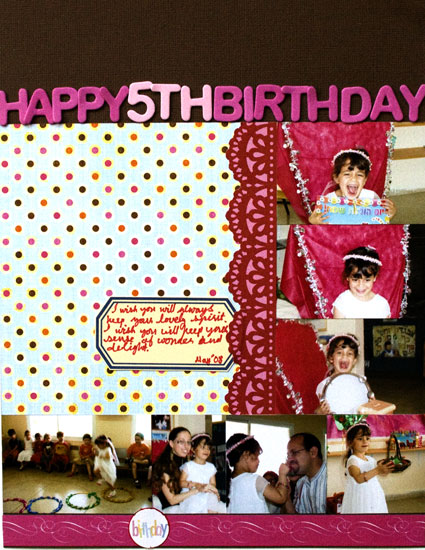
Birthday

Supply

  • Cardstock: American Crafts “Earth Tones
  • Patterned Paper: Sassafras “Sunshine Lollipop” wee bundle.
  • Letter Stickers: generic from the 1 Dollar bin at Target.
  • Journaling tag: Creativity Prompt. (free)
  • Decorative tape: Anna Griffin Border Stickers [I used the Valentine collection]
  • Sticker: KI Memories.

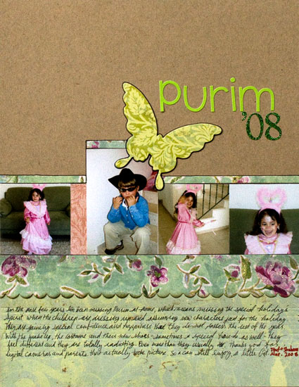
Purim

Supply

Share

Have you been scrapbooking lately? Please leave a comment and share your thoughts and experiences.

Unleashing The Creative Child Within You

Is It Spring Yet – Sharing A Layout And A Techniqe

Tuesday, April 6th, 2010

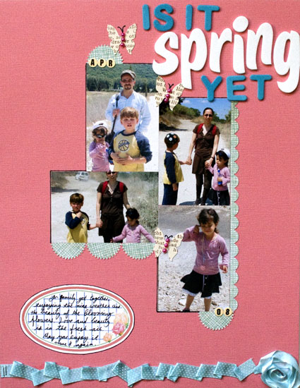
Is It Spring Yet

Supply

  • cardstock: Bazzill
  • Patterned paper: My Minds Eye “Home” (pale blue), Autumn Leaves (text)
  • Adhesive: Fabri Tac by beacon; Glue Glider Pro by Glue Arts; 2 Way Glue by EK Success.
  • Letter Stickers: American Crafts “Lullaby” Thickers (white), Generic from the Dollar bin at Target (turquoise), Jenni Bowlin Tiny Circle Stickers.
  • Tools: Punches: EK Success (scallop border punch), Martha Stewart (starburst); Stapler: Tiny Attacher by Tim Holtz.
  • Journaling tag: Creativity Prompt.
  • Ribbon: American Crafts (Dotted), Generic and o-l-d (seafoam thin satin)
  • Jewels: generic.

How To

Pleated Ribbon

  1. Attach the edge of your ribbon with 2 tiny staples.
  2. Apply a line of fabric glue. Fabri Tac is WONDERFUL. (I wish I was endorsed by Beacon. I am not)
  3. Pleat the ribbon along the glue line irregularly to create a messy look. don’t worry about the pleats opening up at this stage.
  4. Go back and apply a bead of glue underneath each “pleat” to keep it in place.

Ribbon Flower

Also Known as – what to do if you run out of ribbon while pleating but happen to have a similarly colored ribbon at hand…

  1. Put a drop of fabric glue where you want your flower center to be at and adhere the tip of your ribbon strip to it.
  2. Apply some more glue around the glued edge and start turning your ribbon around it, flipping the ribbon occasionally.
  3. Keep applying more beads of glue around and building your “flower” until you are satisfied with its size.
  4. Cut off the excess ribbon and tuck the end underneath one of the pleats with another bead of glue.

Share

Is it spring yet? Share your thoughts by leaving a comment.
If you give the techniques a try – pweeeeeze share 🙂

Make Your Own Planner Workshop
Check out Creativity Prompt’s self paced workshop: “Capture Your Dream”. In this workshop you will capture, follow and make your dream come true as well as document your journey in a fabulous mixed media mini album.
Experiment With Color On Your Layouts – Creativity Prompt

Sunday, January 24th, 2010

Experiment With Color On Your Layouts

I am a great believer in the power of the written word. In fact, only recently I’ve urged you to write as if your next word will be your last. However, there comes a time when you just need to play. Remind yourself what is it that you love so much? Why do your fingers tingle? Why does your heart beat so hard when you stumble upon a pile of ink pads and paint mists?

Unleash your creative child and experiment with colors. Reveal the artist within you!

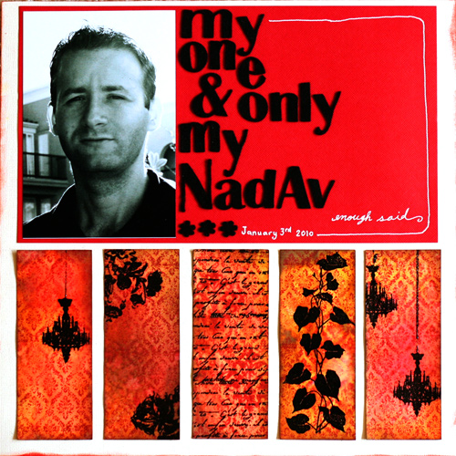
In the layout above I did just that. I experimented and played and had fun. Here is how I did it:

Tools & Supply

Step-By-Step Instructions

  1. Cut the smooth cardstock to 2″ by 5″ strips.
  2. Stamp the petticoat pattern all over the strip with Versamark ink and emboss with a clear embossing powder, using the heat tool.
  3. Squeeze the distress ink pads on a craft sheet and mist with plain water until the ink bubbles up. Then lay your strips – stamped side down – on the wet ink and move it around. Use the heat tool to dry and set the ink.
  4. Spray the strips with the water-diluted pearl medium and with the glimmer mist and blot down the excess ink with a paper towel.
  5. Intensify the color by using the distress inks directly on the strips with the foam blending tool. Work in a circular motion, from the outside in. Use darker colors on the edges of the strips. Wipe the strips with a paper towel or a baby wipe to emphasize the embossed pattern.
  6. Dip your finger in clean water and flip it over the strips. The distress ink will react to the water and spread out. It will create a vintagey worn-wallpaper look. Once you get the affect you want, immediately dry it out with a heat tool to avoid farther spreading of the ink.
  7. Once the strips are completely dry, stamp over them with the rest of the stamps, using Versamark ink and emboss with a black embossing powder. For the Chandelier’s cord I used a glue pen and poured the embossing powder over it.
  8. Attach the strips to the bottom of your cardstock, about an inch from the edge, centered and evenly spaced from each other. (I used both a tape runner and some glue dots.)
  9. Adhere the red mat (11″ by 6½”) above the paper strips.
  10. Adhere the photo on the left edge of the mat, evenly spaced from all 3 adjacent edges.
  11. Assemble your long title with the letter stickers.
  12. Hand draw an outline around the mat with a white gel pen and don’t forget to write down the date.
  13. Use the foam blending tool to ink up the edges of your background cardstock with the Fired Brick distress ink by Rangers.

How was your play time?

Share

If you have any question, suggestion or remark – don’t hesitate to contact me – either leave a comment here, use the contact form or start a new thread on the Creativity Prompt Flickr Group!!!

I would also be very happy to see your own creations, so don’t be shy and share 🙂

Make Your Own Planner Workshop
Check out “Make Your Own Planner” workshop for an affordable monthly and weekly planner in a workshop that keeps on giving…

Things I have Been Up To Lately…

Tuesday, November 24th, 2009

I want to share with you some things I have been up to lately.

  1. Make Your Own Planner WorkshopRelaunching. After receiving many requests from my readers I have finally set up a self-paced version of the popular workshop “Capture Your Dream“. That means that you can take the workshop at any time and start instantly. But isn’t this time of year the perfect time to make your biggest dream come true? I think so too.
  2. Creating. I have been busy making stuff, which means I have been busy being way too happy 🙂 “Making Stuff” and “Happy” are synonyms in my book.

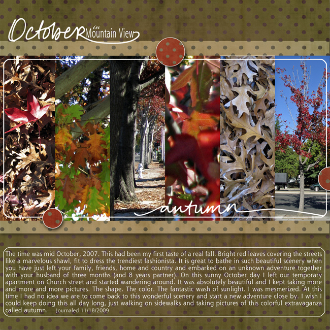
    I have been scrapooking:

    Autumn in Mountain view Digital Layout

    [Supply: Penned Words: Autumn By Shimelle Laine; Autumn Apples Polka Dot Papers by Shimelle Laine]

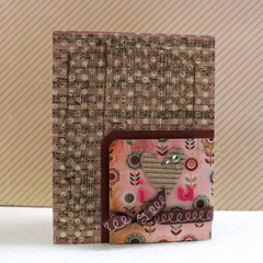
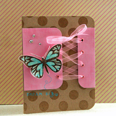
    and I have been making cards:

    handmade cardshandmade cards

    [Supply: Bazzill Kraft cardstock, Basic Grey patterned paper, Hero Arts Heart Winged Butterfly, Artistic Windows & Woodgrain Pattern; Glitz Designs Distress Kit 2 stamp set; Papertrey Ink Polka Dot Basics stamp set; Gems; Ribbon; Crop-a-dile; Eyelets; Corner Chomper; Versamark ink; Clear embossing powder; Heat gun; Rock Candy crackle paint; Pink + Aqua gel pen; Colored pencils; Blender pen; Palette Hybrid ink in Vintage Cream]

Share

What have you been up to lately? Leave a comment and share.

Make Your Own Planner Workshop
Check out the new “Make Your Own Planner” workshop and you may solve this year’s holiday gift shopping problem. An affordable workshop that keeps on giving…

Creativity Prompt – Going Back To Scrapbooking Basics

Friday, June 19th, 2009

Going Back To Scrapbooking Basics: photos and cardstockEvery once in a while when I feel the muse is playing hide-and-seek I like to take a step backward, get rid of all the fluff and go back to the basics. The same applies to scrapbooking.
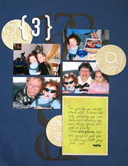
The industry is flooded with beautiful products and tools. Wonderful papers, inks, stamps, embellishments, die-cuts and so on and so forth. Design team members are making layouts that can be presented in art galleries. Little by little, the wonderful hobby of putting together a scrapbook to tell our stories is becoming a tedious chore with a lot of pressure involved.

I am sorry to say that I have heard many creative people deciding to give up scrapbooking altogether. Some did it knowingly and some just don’t get to it anymore because of all the work and pressure involved… Isn’t it a shame?

Pressure and high expectations are known foes of our inner creative child. They practically eliminate our creativity and drive our muse away.

Therefore for this week’s creativity prompt, I prod you to go back to scrapbooking basics. Make a layout with only your photos and cardstock and nothing else. Preferably without using any fancy tools as well.

This is how I did it –

Tools & Supply

Tips

  • Use the grid on your cutting mat and ruler to align and cut elements to size without measuring. Just align the edge with the marks on the grid for a fool-proof straight-cutting and even positioning.
  • You can also use the grid ruler to draw perfect frames around any element. Align the edge of your element with the grid and trace with a marker.
  • Emboss your journaling surface (either a tag or the background cardstock itself) to create subtle journaling guidelines.
  • Vary the tip size of the markers you use to add instant graphic interest to your journaling design.
  • DON’T FORGET THE STORY.
  • Most importantly – don’t fiddle with your layout. Know when to call it done and move forward to the next story. HINT – Perfection is NOT the criteria…

Share

How are you going back to scrapbooking basics? When was the last time you only pulled out your photos and cardstock?

Leave a comment on this post and share!

Workshop - Capture your Dream

Creativity Prompt – Working With Sketches – Scrapbook Layouts

Friday, May 15th, 2009

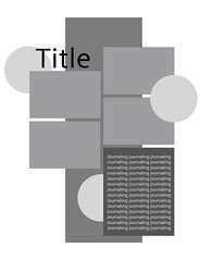
Last week we were using sketches to make handmade cards. This week we go back to our trusty Adobe Photoshop Elements 7.0 or handy-dandy grid paper and plan scrapbook layouts.

The idea is the same – planning the layout in advance helps in looking at the design as a whole, making sure it is harmonious, balanced and complete.

Also using a grid helps to figure out all the measurements for us and all we have left to do is to pull out our supply, cropped photos, paper trimmer and grid ruler and start playing.

In scrapbooking there is an additional advantage which is the ability to use the sketch as a layout template for digital scrapbooking. To learn how to use a digital layout template check out this nifty video by Jessica Sprague.

As a bonus to my fabulous readers I am making this week’s sketch available for a free download (for personal use only) both for digital and traditional scrapbookers. Just click on the right button below:

free template downloadfree template download

Translating the sketch into a layout –


[Music is by: Josh Woodward]

Some tips & techniques shared on the video

  • Use the grid ruler to find the center of your cardstock (or any other element) easily. After finding the center, it’s really easy to figure out the right placement.
  • Use the grid ruler to align your elements together. Just place the ruler on your element and make sure the grid line is aligned with the edge of your element and that the ruler protrudes from the edge at the exact size of your desired gap, then align the next element with the ruler’s edge.
  • Use your paper trimmer together with a stylus to create straight journaling guides. Just score your journaling box or journaling tag at every ¼”.
  • To create a perfect half circle notch, just temporary adhere your photos on a scrap piece of paper (junk mail will do just fine) with the same alignment as they are supposed to have on your layout. Then punch out your half circle, using an hand-held punch.
  • When using a colorful and vibrant photos on top of a bright-colored background you can add interest without overwhelming the eye by using either lace cardstock or an overlay instead of regular patterned paper.
  • Embossing adds texture and interest. To emphasize the embossing use a cardstock with a white core (or otherwise different colored core cardstock) and lightly sand it to reveal the core on the embossed image.

Share

If you have any question, suggestion or remark – don’t hesitate to contact me – either leave a comment here, use the contact form or start a new thread on the Creativity Prompt Flickr group!!!

I would be VERY happy to see your layouts based off of the sketch here, so don’t be shy and share – either leave a link at the comment section or share on the Creativity Prompt Flickr group‘s pool 🙂