/** Font types */

Archive for the ‘Tutorial’ Category

How To Make Your Own Deco Tape

Thursday, October 21st, 2010

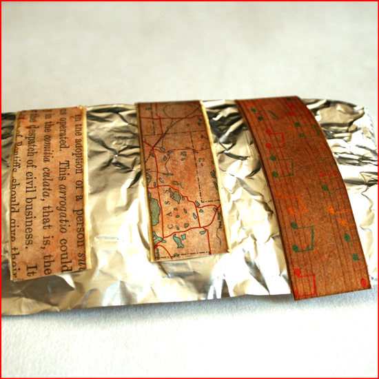
Deco Tape

I LOVE deco tapes.

I always last after beautifully composed photos of beautiful tape.

But I don’t have any of them beauties.

I guess their price doesn’t translate well when I think of their utility…

Then, you can imagine my utter delight when I stumbled upon this DIY Deco Tape Tutorial by my favorite diy-er, Sara.

As my doodling skills are not as impressive as Sara’s, I immediately thought of using patterned paper strips with Mod Podge. It is so easy and the result is quite pleasing.

Although it doesn’t look exactly like “the real deal”, it is very close to it and much more affordable, not to mention – more flexible as for what colors/patterns you’ll be using.

Don’t stop there, you can also ink the tape, stamp on it or just leave it as is and boost its confidence with some pep talk… (Where am I going with that?)

Supply

How To


[Go here to watch on YouTube and while there, please rate, comment and subscribe.]

Step by Step Instructions

  1. Measure the width of the tape you’re using and cut paper strips, the same width as the tape.
  2. Prepare the strips by inking them with distress ink (optional) and conditioning them with water. To do that saturate the strips with a couple spritzes of water using a mister. To add some sheen I added 2 tiny scoops of golden perfect pearl medium to the tap water, but that’s optional too. Blot the excess water with paper towels.
  3. When the strips are completely dry, temporarily adhere the masking tape, in the length of your choice, to a non-stick mat.
  4. Apply a layer of Mod Podge to the tape – not too thin and not too thick – and adhere the paper strips to it. Apply more glue, if necessary. Eliminate all air bubbles by applying pressure with your finger on top of the paper strips. Use your finger, as if it was a brayer. Then let it dry – COMPLETELY.
  5. Apply a second, top layer, of Mod Podge. Apply it generously – it will be used as a sealer. Let it dry COMPLETELY.
  6. Remove the excess glue by going over it with your fingers and peel off the tape from the non stick mat. Transfer the tape to a non stick sheet you use in the kitchen. You can also roll them against a round handle (the brush’s handle is perfect for that) to make your own tape-roll.

Share

Do you work with deco tape? What do you use it for? Please share by leaving a comment.

Make Your Own Planner 2012
Check out Creativity Prompt’s new and unique self paced workshop: “Make Your Own Planner”.
This workshop will show you how to make a beautiful handmade planner for the year 2012. Not only are you going to get the entire meticulously designed planner kit for instant download, but you will also get a high resolution video tutorial as well as step-by-step instructions to guide you on each step of the way. Either treat yourself with a fresh and creative start for the coming new year, or get it to create wonderful gifts for your family and friends.
Join now
How To Make A Recycled Lunch Bags Mini Album

Thursday, September 30th, 2010

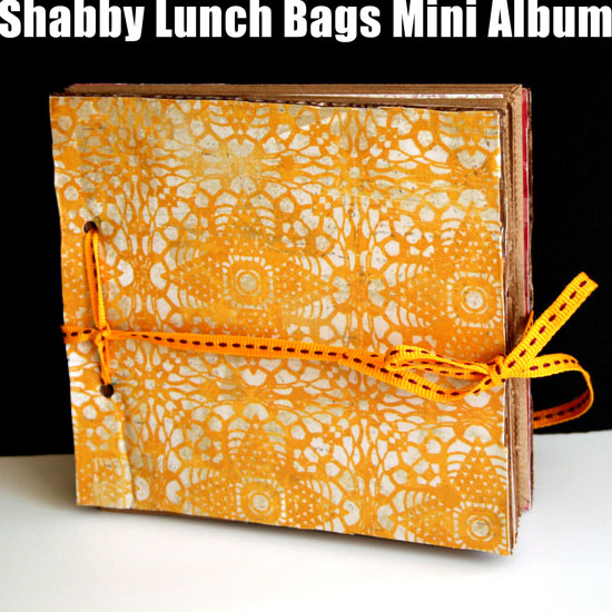
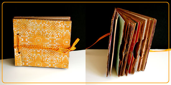
Lunch Bags Mini Album

It didn’t take me long to come up with another carfty recycling project. After all, making mini books and albums is much more fun then carrying all the empty boxes that arrive each week from Amazon to the recycling bin, isn’t it? (I refuse to admit I have an ACOD – ‘Amazon Compulsive Ordering Disorder’… Plus one of them boxes must be my husband’s me thinks.)

Anyway…

Here is another recycling project I share with you, in which I transform 5 small lunch bags and a small box into a super cute shabby mini album with room for memorabilia, ephemera, photos, hidden journaling and what not.

Supply

How-To


[Go here to watch on YouTube and while there, please rate, comment and subscribe.]

Step-By-Step Instructions

  1. Adhere the flap of the lunch bag, inwards, by applying adhesive just to the edges of the flap, so you create a small pocket. Fold in half and repeat with all the bags.
  2. Measure the height and width of the folded bag and cut the cover pieces to the same size out of the box, using a sharp craft knife. Don’t apply pressure on the knife, just use shallow back and forth movements with the knife until the cardboard is separated.
  3. Cover the cover pieces with patterned paper – start by applying a thin but thorough layer of Mod Podge with a foam brush. Adhere the paper onto the cardboard. Flip the piece and cut off the excess paper by using the edges of the cardboard as a straight edge for your craft knife. Lastly, apply a thick layer of Mod Podge to seal it off. Repeat on both sides of both cover pieces.
  4. Cover the inside pages of the lunch bag signatures with patterned paper, make sure you keep the flap pockets opened.
  5. Measure 1 inch above and below the center point of the edge of the cover and mark it. Punch holes through these tick marks and repeat on all pages and the back cover.

Lunch bags mini album preview

Share

If you have any question, suggestion or remark – don’t hesitate to contact me – either leave a comment here, use the contact form or start a new thread on the Creativity Prompt Flickr Group!!!

I would also be very happy to see your own creations, so don’t be shy and share 🙂

Make Your Own Planner 2012
Check out Creativity Prompt’s new and unique self paced workshop: “Make Your Own Planner”.
This workshop will show you how to make a beautiful handmade planner for the year 2012. Not only are you going to get the entire meticulously designed planner kit for instant download, but you will also get a high resolution video tutorial as well as step-by-step instructions to guide you on each step of the way. Either treat yourself with a fresh and creative start for the coming new year, or get it to create wonderful gifts for your family and friends.
Join now
Another Day, Another Card

Thursday, September 23rd, 2010

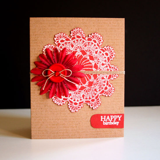
Happy Birthday Card

After making yesterday’s cards I felt inspired to play around with Hero Arts’s Circle Doily cling stamp some more. Plus, in the meantime I got invited to another birthday party of a very dear friend…

Then again, do I really need a reason to make another card? I didn’t think so either.

This time I thought I will use autumnal colors to indicate the season.

Supply

How To

  1. Start by cutting and folding the card base (cut at 8½” by 5½” and fold at 4¼”).
  2. Stamp the big definition stamp on the card base with a very light ink color (Antique Linen).
  3. Stamp the doily with Versamark ink on the red cardstock and pour over some white embossing powder. Tap off the excess and heat emboss with a heat gun.
  4. Cut around the doily with precision scissors and adhere to the card’s front.
  5. Cut a small slit on the card’s fold and feed a string through it, make sure both end will “meet” at the front of the card.
  6. Feed the ends through the flower, add a couple foam adhesive dots to the flower for an extra hold and adhere in place.
  7. Feed the ends through the button holes and tie in a bow. Secure the bow with a dot of clear adhesive and conceal the adhesive with a gem.
  8. Stamp the greeting with white embossing powder on the same red cardstock. Apply embossing powder. Tap off the excess powder and heat emboss.
  9. Cut around the greeting, leave some more room at the end pointing inwards and round both corners of that end with a corner rounder. Adhere in place.

Share

What is your favorite stamp or stamping technique? Do you rather make cards without any stamping involved? Please share your opinions and thoughts by leaving a comment.

Welcome Little One Workshop
Check out Creativity Prompt’s new and unique self paced workshop: “Welcome Little One”. This workshop will provide you with everything you need, and then some, to make a fabulous handmade mini album to record the first moments of a new born baby.

Video Tutorial – How To Make A Mini Book Out Of Soap Wrap

Monday, September 13th, 2010

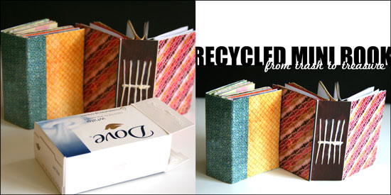
Recycled Mini Book

The Story

You know how much I love recycling and turning my trash into treasure so it’s no surprise that I came up with this project after my bathroom got filled with empty boxes of soap.

When Amy from Mod Podge Rocks e-mailed me and asked if I wanted to use some of the Plaid products on my future projects I knew this mini book idea would be perfect for the test run. The funny thing is that just before Amy e-mailed me, I already bought a huge bottle of Mod Podge Gloss for paper just the week before so I had a chance to try out 2 other products that got sent to me by the company: Mod Podge Hard Coat and Mod Podge Sparkle.

I really, really, really loved the Mod Podge Hard Coat. I initially chose it for another project. I accidentally ruined a set of coasters I had and thought the Hard Coat formula will be perfect to restore them. However I used this as a top coat for the mini book and it is amazing. It is a bit thicker than the original formula and it dries clear into a hard coat (just as its name suggests…) that seals the cover and secure the binding of the book. I really recommend this for book makers.

The Sparkle formula has fine glitter in it and it adds a fun glittery top coat to any surface. What i like about it is that it adds the glitter without the mess that usually goes with it… You just need to apply it with a foam brush and the glittery particles doesn’t rub off of it after it dries up.

The recycled mini book can be made out of any box, of any size, so I purposefully left out exact measurement, so you can use the same technique on any empty box that comes your way.

So if you feel like playing along and learn how to make this recycled mini book, keep on reading.

Tools and Supply

This project uses MINIMAL supply, as it’s mostly recycled.

How To


[Go here to watch on YouTube and while there, please rate, comment and subscribe.]

Step by Step Instructions

  1. Flatten the box by carefully disconnecting the connecting flaps at the bottom and inside the box. You may also use a craft knife for that.
  2. Use your scissors to cut off the flaps, as well as the inner flap and the short edge attached to it, so you are left with 3 sections: 2 cover sections and a spine, already creased for you…
  3. Measure the width and height of the cover sections and the spine and cut pieces of patterned paper at the same size for the cover. If you want to conceal the binding you will need one piece the size of the cover section and the other size larger by the width of the spine plus an additional inch. If you choose to conceal the binding, adhere the outer cover papers at the end.
  4. Apply a thin layer of Mod Podge to the cover section and the spine, lay the pattern paper on top of it and apply an additional layer of Mod Podge on top to seal it off. Put it aside to dry.
  5. Take a plain copier paper, the same width and height of the spine and mark 3 horizontal lines on it – one at the center and two additional ones, about an inch apart. If you work on a larger box, you may want to add more lines, equally separated from each other.
  6. Next mark equally separated vertical line, each line stands for one signature. I used 5 signatures, so I drew 5 vertical lines, one at the center and the rest in ¼” intervals.
  7. Cut your signature inserts to double the width of the cover section and the same height and fold each signature of paper inserts in half.
  8. Line up the paper guide with the inner crease of the signature and poke holes on the crease next to each of the 3 horizontal lines. these holes will help later with the binding process.
  9. After the inner cover is layered with paper with a base and top coat of Mod Podge and completely dry, line up the paper guide with the inner spine and poke a hole at each of the intersections of the horizontal lines with the vertical lines.
  10. Start binding the signatures together. Take the first one, insert the needle through the center hole and into the center hole of the signature, than to the upper hole and back from the bottom hole, into the center hole to the outer cover – repeat on all the signatures.
  11. Once you finish binding all the signatures together, weave the thread through the center line of threads until it meets the initial loose end and tie them together in a tight knot. Cut the excess thread and tidy up the knot to look as smooth and straight as possible.
  12. Lastly, apply a layer of Mod Podge Top Coat on top of the outer cover and the spine, it will secure the binding as well. You may also apply an additional layer of Sparkle Mod Podge if you want a fun glittery finish to your mini book.
  13. Enjoy!!!

Share

If you have any question, suggestion or remark – don’t hesitate to contact me – either leave a comment here, use the contact form or start a new thread on the Creativity Prompt Flickr Group!!!

I would also be very happy to see your own creations, so don’t be shy and share 🙂

Make Your Own Planner 2012
Check out Creativity Prompt’s new and unique self paced workshop: “Make Your Own Planner”.
This workshop will show you how to make a beautiful handmade planner for the year 2012. Not only are you going to get the entire meticulously designed planner kit for instant download, but you will also get a high resolution video tutorial as well as step-by-step instructions to guide you on each step of the way. Either treat yourself with a fresh and creative start for the coming new year, or get it to create wonderful gifts for your family and friends.
Join now

Make Your Own Planner Workshop
Check out Creativity Prompt’s self paced workshop: “Capture Your Dream”. In this workshop you will capture, follow and make your dream come true as well as document your journey in a fabulous mixed media mini album.

Hybrid Mini Album – Step By Step

Monday, September 6th, 2010

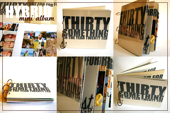
Hybrid Mini Album - Collage

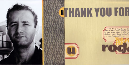
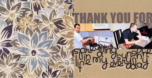
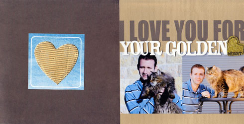
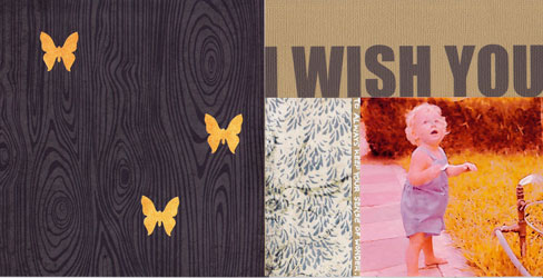
On Friday my husband turned thirty.

My beautiful, wonderful, perfect husband has joined the thirty something group and I will join him in October.

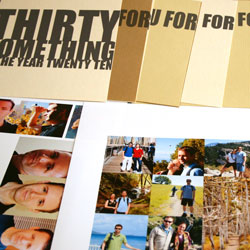
I wanted to make a book telling him how awesome he is while incorporating photos from the last year in our life (and one from 29 years ago…)

The easiest way for me to go about it was to make a hybrid mini album.

A hybrid is an album created partly digitally on the computer and partly traditionally with papers, adhesive and other scrapbooking goodies.

I created all the photo collages and titles for the album with Adobe’s Photoshop Elements 8.0 and the rest by hand, here is how I went about it:

Supply

In this album I was using a ton of different products I have had piled up in my office, so I will not tire you with the complete list. I will only highlight some of the main products I was using and loving.

Step By Step Instructions

Digital Part

  1. Open a letter size file with 300 DPI resolution.
  2. Use the rectangle shape tool to draw a 6 by 6 square in the middle of your page – that will be your page base. Choose a very faint color for the square, to save ink later…
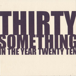
  3. Create your design only on the 6″ by 6″ area. (I only used fonts, “Impact” in particular.)
  4. To print your design, click on the eye icon next to the layers with your page design, that will conceal everything but the 6 by 6 square.
  5. Print your page on plain copy paper. It will be used as your positioning guide later.
  6. Now conceal the square by clicking on the eye icon and reveal your design again.
  7. Adhere a 6″ by 6″ piece of cardstock to the printed rectangle on your copy paper. Use temporary adhesive to make its removal easier.
  8. Put your copy paper through your printer again, with the cardstock attached to it.
  9. Print your page design.
  10. Repeat. (You don’t have to print the positioning guide again if you don’t move the square on your screen.)
  11. For the photos I just cropped each photo individually to the size I wanted it and layered all the photos on a letter size document I then printed on photo paper.
  12. raw materials

Traditional Part

  1. Crop all your photos.
  2. Design your pages, add letter stickers to add texture to the rather flat printed titles.
  3. You may also use the free journaling tags you can find here, on Creativity Prompt. They will help you add your journaling in an easy and polished way.
  4. After you finished all the pages design, gather all the pages in the order you want them to be and make sure no page is rotated.
  5. I also added two 6″ by 6″ acetate pages to protect the front and back cover pages.
  6. Use the crop-a-dile to punch holes for the book rings. Punch them at 1″, 3″ and 5″, about ½” from the edge.

Photos of the Finished Mini Album

Hybrid Mini Album Pages

Hybrid Mini Album Pages

Hybrid Mini Album Pages

Hybrid Mini Album Pages

Hybrid Mini Album Pages

Hybrid Mini Album Pages

Hybrid Mini Album Pages

Hybrid Mini Album Pages

Hybrid Mini Album Pages

Hybrid Mini Album Pages

Hybrid Mini Album Pages

Share

Do you use the computer to add titles or other elements to your scrapbook pages? Please share by leaving a comment here.

Welcome Little One Workshop
Check out Creativity Prompt’s new and unique self paced workshop: “Welcome Little One”. This workshop will provide you with everything you need, and then some, to make a fabulous handmade mini album to record the first moments of a new born baby.

Park Adventures And How To Use Fonts As Die Cuts

Wednesday, September 1st, 2010

Park Adventures

[Fonts: Impact and Adler; Digital Kit: KD Crush by Karla Dudley.]

As a scrapbooker, or a memory archiver, I find myself doing things I would never imagine doing, just for the sake of collecting visual memories.

This layout is a wonderful example of such irrational behavior.

The pictures in the layout were taken with a regular 55mm lens – no tele lens, no zoom – I was standing right in front of the huge bear.

Gladly, I caught Mr. bear on a good day…
(I hope he isn’t traumatized by the insane human who ran after him with a camera)

How To Create Digital Letter Die Cuts

In this layout I used Karla Dudley’s newest digital kit, “KD Crush”, which will be available tomorrow at the Digichic online store. The kit is based on a natural color palette, just in time for fall and includes beautiful papers, brushes and elements (including an alpha set).

However, I used it a bit differently by masking the patterned paper to a regular true type font.

Here is how I made the title for my layout above:

  1. Choose any font, preferably a dominant one, such as “Impact” to give room for the digital patterned paper.
  2. Type down your title, each word separately to allow maximum control over its position.
  3. Decide what is the FINAL position and size of each letter in the title.
  4. Simplify all the title layers (by right clicking on each layer and selecting “simplify”).
  5. Merge the layers together (just select all the relevant layer and then right click on your selection and opt for “merge layers”. To select a couple layers together press the CTR or CMD key while clicking on the layers).
  6. Insert any patterned paper and make sure its layer is directly above the title layer.
  7. Mask the two layers together by pressing “CTR+G” or “CMD+G”.
  8. You may now merge the 2 layers together to add a drop shadow or leave it as is.

Share

Have you ever acted out of character just to take a picture or preserve a memory? Please share your story by leaving a comment here.

Welcome Little One Workshop
Check out Creativity Prompt’s new and unique self paced workshop: “Welcome Little One”. This workshop will provide you with everything you need, and then some, to make a fabulous handmade mini album to record the first moments of a new born baby.

How To Change the Color of the Journaling Tags

Wednesday, August 4th, 2010

I have been posting a lot of free printable journaling tags.

I have been asked several times how can you change the color of these tags with a photo editing software, such as Photoshop or Photoshop Elements and each time I answered individually.

It took me a while to figure out that my answer may interest many of you too, so here it goes:

  1. Open the pdf file with photoshop.
  2. Open a new layer underneath the file layer.
  3. Make sure your file layer is highlighted and pick the white in the file, using the magic wand tool.
  4. Press delete.
  5. From the menu bar choose “Edit” =>”Fill in layer” => choose “color” and change it to any color you want.
  6. Fill in the “preserve transparency” check box and click “apply” or “ok”.
  7. If the last 2 steps don’t work for you, try to press CTR+U or CMD+U and change the hue and saturation settings.

I hope that helps you guys 🙂

Have a great day.

Nip and Tuck Your Digital Brushes

Thursday, June 3rd, 2010

Celebrate Seven

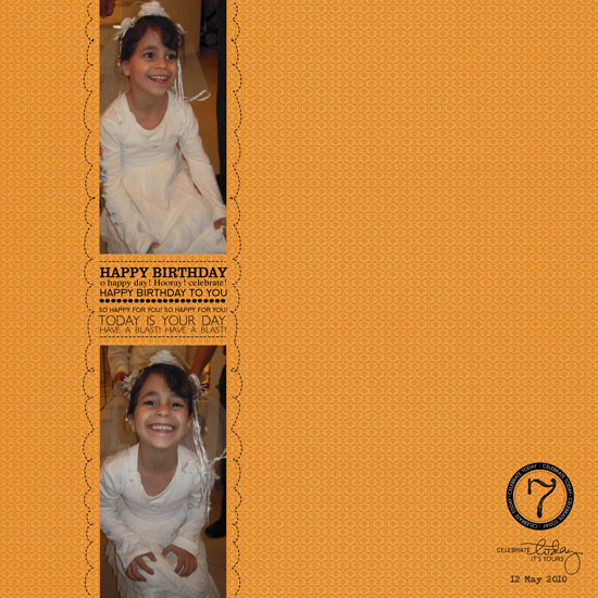
[Font: Adler; Digital Kits: KD Happy Day & KD Digi Essentials 5 (the number 7) – all by Karla Dudley.]

I may be prejudiced but I think my niece has the brightest, most beautiful smile I have ever seen.

I’d send some celebrities over for a red carpet seminar if I could. I really would.

Anyways…

This is the third birthday that I have missed and I am forever grateful that my sister takes the time to take the pictures as well as send them my way. I value these pictures so much, in fact, that I always immediately try to put together layouts with the stories behind the photos. As I only live vicariously through these photos, the stories I can tell aren’t so long and detail oriented. I mostly just try to capture the moment visually – as I imagine it had been.

In this layout I used Karla Dudley’s new kit: KD Happy Day, almost exclusively (minus the digit ‘7’). On the right corner of my layout you may find a word-art image: “Celebrate today, it’s yours”. If you take a moment and look at the kit, you won’t find this image as it shows on my layout. Why? Because I had engaged myself in a minor digital surgery… Nipping the second part of the sentence and tucking it underneath.

Rearranging a digital image is basically the same as snipping a clear stamp off and repositioning its parts to conform to your design and needs (or inking up a different part of the stamp each time). Here is how to do that:

How To

  1. Open your image on Photoshop Elements. (If you are concerned about writing over your original image, use the ‘open as’ option.)
  2. Pick the rectangle selection tool and by clicking and dragging, choose the part you wish to sever. When you are done you will see the marching ants sign around the outline of the image. Make sure you haven’t accidentally picked any other part of the image. If you did – just choose it, while clicking the ALT/OPT key, to deselect.
  3. Make sure the layer of the image is selected – it will be highlighted if so.
  4. Pick the move tool and click and drag the part you have selected to its new place – it’s that easy. (You may also delete it altogether by clicking the DELETE key while it’s selected).
  5. Be careful not to get addicted and makeover your entire stash of digital images.

Share

Have you ever tried to alter your digital stash (or your traditional stash…)? Please, do share. Just leave a message and brag.

Make Your Own Planner Workshop
Check out Creativity Prompt’s self paced workshop: “Capture Your Dream”. In this workshop you will capture, follow and make your dream come true as well as document your journey in a fabulous mixed media mini album.

Hybrid Card – Using Digital Alpha Sets

Wednesday, June 2nd, 2010

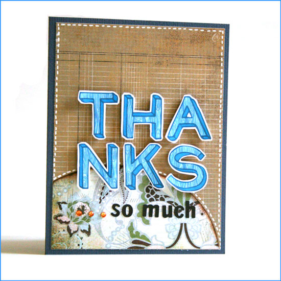
Hybrid Thanks Card

[Supply: You Are Amazing (woodgrain alpha) by Shimelle Laine for Two Peas In A Bucket, Basics + Cappella (patterned paper + small alpha stickers) by Basic Grey, Rhinestones by Kaiser Scrapbooks, Earthtones cardstock by American Crafts, White gel pen by Uniball, Foam dimensionals.]

Step By Step Instructions

Using Digital Alphas

  1. Open a new document in Photoshop Elements: Width: 8.5″ Height: 11″ DPI: 300.
  2. Use the rectangle shape tool and add a rectangle, sized 4.25″ by 5.5″. By doing that you make sure the size of your alphas will be perfect.
  3. Open up all the different letters you need for your greeting from the kit. Use the move tool to drag and drop them on your new document.
  4. Before positioning the letters you need to resize them. To do that, line them all up in one straight line – regardless of the way you want to put them on your card.
  5. Pick all the layers with the letters (Just click on the layer with your CTR/CMD button pressed down) – make sure they are all highlighted.
  6. Pick the move tool ,then press align and opt for the center alignment.
  7. While your layers are still all highlighted – click on one of the edges of the word and drag the cursor towards the center. This way you are resizing the letters proportionally.
  8. After you get to a size you are please with, position the letters the way you want them on the card. The rectangle shape you drew earlier will help you keep the proportions and size right.
  9. Conceal the layer with the rectangle shape by clicking on the eye icon and print your page on a white, smooth cardstock.
  10. The alphas on Shimelle’s new kit have a faint outline that you can use as cutting guidelines.

Assembling The Card

  1. Cut the patterned background paper to 5.25″ by 4″, adhere to your cardstock base.
  2. Cut the accent piece of patterned paper in a curve (using an ellipse cutter – I used Coluzzle) – make sure the base is 4″ wide.
  3. Ink up the top edge of your curved paper and adhere it to the bottom of the patterned paper you adhered before.
  4. Adhere the individual letters with foam dimensional stickers. Cut the foam adhesive down to size if needed.
  5. Add the letter stickers and the rhinestones.
  6. Give the card to a friend to show that you care and to say thank you…

Share

Who would you like to say thanks to? Have you made a hybrid card before? Share by leaving a comment here 🙂

Think Outside the Box – Literally + Selective Coloring With Photoshop Elements

Thursday, May 6th, 2010

One way to get out of a creative rut is to use our stash – not as intended…

Use a “girly” collection for a boy’s layout or vice versa [as I did below].
Use a Christmas collection for a 4th of July layout.
Use a travel collection for a wedding.
Use patterned paper as a background and plain cardstock as an accent.
Use paper flowers as journaling blocks.
Use a winter themed paper for a summary layout.

Just ignore what the “box” says and create.
Free your mind.

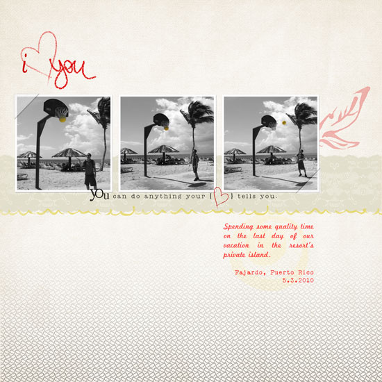
In this layout I used Karla Dudley’s new kit KD Fly Girl for a manly layout of my husband shooting hoops at the beach:

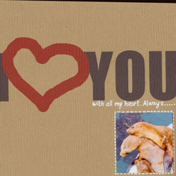
i Heart you

[Fonts: Marketing Script, VTPortableRemington; Digital Kits: KD Fly Girl by Karla Dudley.]

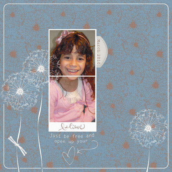
And in this layout I used Karla’s KD Fly Boy kit to create a girlie-girl layout featuring my princess niece:

Believe

[Font: Rough Typewriter; Digital Kits: KD Fly Boy by Karla Dudley.]

Photoshop Elements Tip – Selective Coloring

On my “I heart You” layout I turned my photos to black and white (by de-saturating them) and kept just the vibrant yellow color of the ball.

The azure sky and turquoise ocean are beautiful, but they are distracting from the story I want to tell.

By removing the color of everything but the ball – I am drawing attention to it and hinting that the focus of my story is there.

There are 3 ways to get that look – choose the one most comfortable to you:

Method 1

  1. Duplicate the photo’s layer (press CTRL+J on a PC or CMD+J on a MAC).
  2. Make sure your upper layer is highlighted and de-saturate the colors all the way to the left (press CTRL+U on a PC or CMD+U on a MAC).
  3. Make sure your upper layer is highlighted and choose the eraser tool (work with the default circular brush). Lightly erase just the object whose color you’d like to retain.
  4. Merge both layers when you’re done.
  5. [P.S. This is also how I “colored” the heart red on the kit’s PNG file.]

Method 2

  1. Duplicate the photo’s layer (press CTRL+J on a PC or CMD+J on a MAC).
  2. Make sure your upper layer is highlighted and de-saturate the colors all the way to the left (press CTRL+U on a PC or CMD+U on a MAC).
  3. Make sure your upper layer is highlighted and choose the Quick Selection Tool. Click on the object whose color you wish to retain until it is highlighted completely by the marching ants. If you “slip” just unselect by pressing ALT on a PC or OPT on a MAC while simultaneously clicking on the part you don’t want selected.
  4. Press delete.
  5. Merge both layers together.

Method 3

  1. Choose the Quick Selection Tool. Click on the object whose color you wish to retain until it is highlighted completely by the marching ants. If you “slip” just unselect by pressing ALT on a PC or OPT on a MAC while simultaneously clicking on the part you don’t want selected and duplicate your selection (press CTRL+J on a PC or CMD+J on a MAC).
  2. Deselect (press CTRL+D on a PC or CMD+D on a MAC)
  3. Make sure your lower layer is highlighted and de-saturate the colors all the way to the left (press CTRL+U on a PC or CMD+U on a MAC).
  4. Merge both layers together.

Share

Are you using your stash in an untraditional way? Please share your ideas/ projects with us.